


| Home |
| Search |
| Today's Posts |
|
|
|
#1

Posted to microsoft.public.excel.misc
|
|||
|
|||
|
I have created a column graph, and I know I can manually colour the
columns to reflect their values. I was wondering though if I can get them to automatically colour based on the values being used to create the columns i.e. a value from 0-79 would result in a red column a value from 80-99 woudl result in a yellow column a value of 100 would result in a green column I've heard it can be done through VB, but unless the instructions were super detailed for me to follow I would be lost! Thanks for any help that you can give. |
|
#2
Posted to microsoft.public.excel.misc
|
|||
|
|||
|
Add helper columns to get values for those ranges, such
C2: =IF(B2<80,B2,NA()) D2: =IF(AND(B2=80,B2<100),B2,NA()) and so on, copy these down and then chart columns A, C, D etc. This will give you multiple series and you can colour each series to your preferred colour. -- HTH Bob (there's no email, no snail mail, but somewhere should be gmail in my addy) wrote in message ... I have created a column graph, and I know I can manually colour the columns to reflect their values. I was wondering though if I can get them to automatically colour based on the values being used to create the columns i.e. a value from 0-79 would result in a red column a value from 80-99 woudl result in a yellow column a value of 100 would result in a green column I've heard it can be done through VB, but unless the instructions were super detailed for me to follow I would be lost! Thanks for any help that you can give. |
|
#3
Posted to microsoft.public.excel.misc
|
|||
|
|||
|
On May 20, 9:48*am, "Bob Phillips" wrote:
Add helper columns to get values for those ranges, such C2: =IF(B2<80,B2,NA()) D2: =IF(AND(B2=80,B2<100),B2,NA()) and so on, copy these down and then chart columns A, C, D etc. This will give you multiple series and you can colour each series to your preferred colour. -- HTH Bob (there's no email, no snail mail, but somewhere should be gmail in my addy) wrote in message ... I have created a column graph, and I know I can manually colour the columns to reflect their values. I was wondering though if I can get them to automatically colour based on the values being used to create the columns i.e. a value from 0-79 would result in a red column a value from 80-99 woudl result in a yellow column a value of 100 would result in a green column I've heard it can be done through VB, but unless the instructions were super detailed for me to follow I would be lost! Thanks for any help that you can give.- Hide quoted text - - Show quoted text - Thanks Bob, I'm a little bit lost ( and a basic excel user) - what will those formulas do exactly? Right now I guess I just have one series, and it takes the info from each cell - there are only 4, that have the numbers in them, i.e.34, 55, 81, 100. Should I be doing this another way? |
|
#4
Posted to microsoft.public.excel.misc
|
|||
|
|||
|
On May 20, 10:17*am, wrote:
On May 20, 9:48*am, "Bob Phillips" wrote: Add helper columns to get values for those ranges, such C2: =IF(B2<80,B2,NA()) D2: =IF(AND(B2=80,B2<100),B2,NA()) and so on, copy these down and then chart columns A, C, D etc. This will give you multiple series and you can colour each series to your preferred colour. -- HTH Bob (there's no email, no snail mail, but somewhere should be gmail in my addy) wrote in message ... I have created a column graph, and I know I can manually colour the columns to reflect their values. I was wondering though if I can get them to automatically colour based on the values being used to create the columns i.e. a value from 0-79 would result in a red column a value from 80-99 woudl result in a yellow column a value of 100 would result in a green column I've heard it can be done through VB, but unless the instructions were super detailed for me to follow I would be lost! Thanks for any help that you can give.- Hide quoted text - - Show quoted text - Thanks Bob, I'm a little bit lost ( and a basic excel user) - what will those formulas do exactly? Right now I guess I just have one series, and it takes the info from each cell - there are only 4, that have the numbers in them, i.e.34, 55, 81, 100. Should I be doing this another way?- Hide quoted text - - Show quoted text - Bob? anyone? |
|
#5
Posted to microsoft.public.excel.misc
|
|||
|
|||
|
They create a column of values or #N/A depending upon the actual value. You
then chart these columns not the original ones. -- HTH Bob (there's no email, no snail mail, but somewhere should be gmail in my addy) wrote in message ... On May 20, 10:17 am, wrote: On May 20, 9:48 am, "Bob Phillips" wrote: Add helper columns to get values for those ranges, such C2: =IF(B2<80,B2,NA()) D2: =IF(AND(B2=80,B2<100),B2,NA()) and so on, copy these down and then chart columns A, C, D etc. This will give you multiple series and you can colour each series to your preferred colour. -- HTH Bob (there's no email, no snail mail, but somewhere should be gmail in my addy) wrote in message ... I have created a column graph, and I know I can manually colour the columns to reflect their values. I was wondering though if I can get them to automatically colour based on the values being used to create the columns i.e. a value from 0-79 would result in a red column a value from 80-99 woudl result in a yellow column a value of 100 would result in a green column I've heard it can be done through VB, but unless the instructions were super detailed for me to follow I would be lost! Thanks for any help that you can give.- Hide quoted text - - Show quoted text - Thanks Bob, I'm a little bit lost ( and a basic excel user) - what will those formulas do exactly? Right now I guess I just have one series, and it takes the info from each cell - there are only 4, that have the numbers in them, i.e.34, 55, 81, 100. Should I be doing this another way?- Hide quoted text - - Show quoted text - Bob? anyone? |
|
#6
Posted to microsoft.public.excel.misc
|
|||
|
|||
|
I've written an illustrated tutorial about this technique:
http://peltiertech.com/Excel/Charts/...nalChart1.html I've also blogged about a few VBA approaches, but the formulaic approach above is preferred. http://peltiertech.com/WordPress/200...arts-by-value/ http://peltiertech.com/WordPress/200...ategory-label/ http://peltiertech.com/WordPress/200...y-series-name/ - Jon ------- Jon Peltier, Microsoft Excel MVP Tutorials and Custom Solutions Peltier Technical Services, Inc. - http://PeltierTech.com _______ wrote in message ... On May 20, 9:48 am, "Bob Phillips" wrote: Add helper columns to get values for those ranges, such C2: =IF(B2<80,B2,NA()) D2: =IF(AND(B2=80,B2<100),B2,NA()) and so on, copy these down and then chart columns A, C, D etc. This will give you multiple series and you can colour each series to your preferred colour. -- HTH Bob (there's no email, no snail mail, but somewhere should be gmail in my addy) wrote in message ... I have created a column graph, and I know I can manually colour the columns to reflect their values. I was wondering though if I can get them to automatically colour based on the values being used to create the columns i.e. a value from 0-79 would result in a red column a value from 80-99 woudl result in a yellow column a value of 100 would result in a green column I've heard it can be done through VB, but unless the instructions were super detailed for me to follow I would be lost! Thanks for any help that you can give.- Hide quoted text - - Show quoted text - Thanks Bob, I'm a little bit lost ( and a basic excel user) - what will those formulas do exactly? Right now I guess I just have one series, and it takes the info from each cell - there are only 4, that have the numbers in them, i.e.34, 55, 81, 100. Should I be doing this another way? |
|
#7
Posted to microsoft.public.excel.misc
|
|||
|
|||
|
Jon, I'd found your blog before and because I'm a VERY basic user I
wasn't able to figure it out. Thanks for replying, maybe you can help me a little bit more. I have a report, and on the front page we have a category breakdown, a summary which includes the % result from 3 previous test and the current result. I'm trying to have the chart show on the page, relecting each of the 4 tests, and a result scale from 0-100. Here is what I have now - 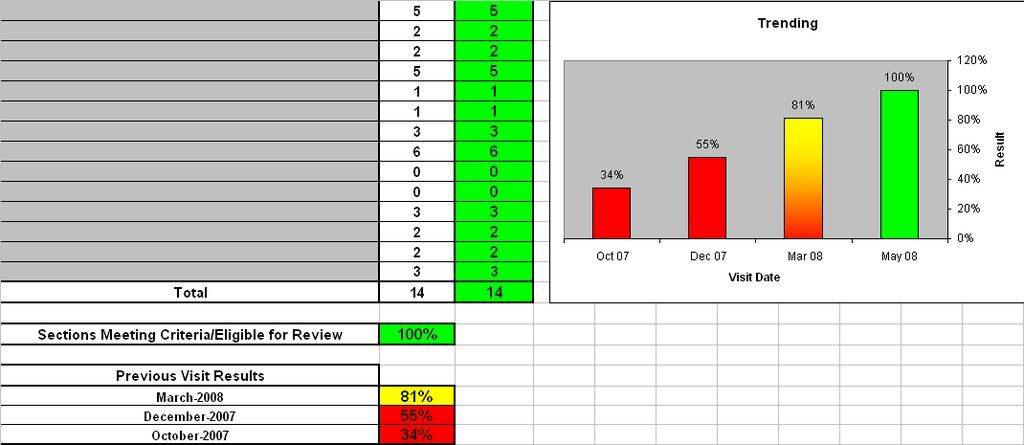 I had coloured the columns myself, but I'd like them to colour automatically as do the cells when the values are changed. I have tried to work with your blog info and come up with this: Min 0 79 99 Max 79 99 100 X Values Y Values Between 0 and 79 Between 79 and 99 Between 99 and 100 Visit 1 31 31 #N/A #N/A Visit 2 55 55 #N/A #N/A Visit 3 81 #N/A 81 #N/A Visit 4 100 #N/A #N/A 100 But now have no idea if that is right or what to do with it...as you can tell I really don't know a whole lot about this and would appreciate any help you can give! |
|
#8
Posted to microsoft.public.excel.misc
|
|||
|
|||
|
So far so good. Select the first column (Visit 1, etc.) then hold Ctrl and
select the third thru fifth columns (with the formulas) and create a stacked column chart. This should be all you need to do, plus format as needed. - Jon ------- Jon Peltier, Microsoft Excel MVP Tutorials and Custom Solutions Peltier Technical Services, Inc. - http://PeltierTech.com _______ wrote in message ... Jon, I'd found your blog before and because I'm a VERY basic user I wasn't able to figure it out. Thanks for replying, maybe you can help me a little bit more. I have a report, and on the front page we have a category breakdown, a summary which includes the % result from 3 previous test and the current result. I'm trying to have the chart show on the page, relecting each of the 4 tests, and a result scale from 0-100. Here is what I have now - I had coloured the columns myself, but I'd like them to colour automatically as do the cells when the values are changed. I have tried to work with your blog info and come up with this: Min 0 79 99 Max 79 99 100 X Values Y Values Between 0 and 79 Between 79 and 99 Between 99 and 100 Visit 1 31 31 #N/A #N/A Visit 2 55 55 #N/A #N/A Visit 3 81 #N/A 81 #N/A Visit 4 100 #N/A #N/A 100 But now have no idea if that is right or what to do with it...as you can tell I really don't know a whole lot about this and would appreciate any help you can give! |
|
#9
Posted to microsoft.public.excel.misc
|
|||
|
|||
|
On May 21, 4:31*pm, wrote:
Jon, I'd found your blog before and because I'm a VERY basic user I wasn't able to figure it out. Thanks for replying, maybe you can help me a little bit more. I have a report, and on the front page we have a category breakdown, a summary which includes the % result from 3 previous test and the current result. I'm trying to have the chart show on the page, relecting each of the 4 tests, and a result scale from 0-100. Here is what I have now - I had coloured the columns myself, but I'd like them to colour automatically as do the cells when the values are changed. I have tried to work with your blog info and come up with this: * * * * Min * * 0 * * * 79 * * *99 * * * * Max * * 79 * * *99 * * *100 X Values * * * *Y Values * * * *Between 0 and 79 * * * *Between 79 and 99 * * * Between 99 and 100 Visit 1 31 * * *31 * * *#N/A * *#N/A Visit 2 55 * * *55 * * *#N/A * *#N/A Visit 3 81 * * *#N/A * *81 * * *#N/A Visit 4 100 * * #N/A * *#N/A * *100 But now have no idea if that is right or what to do with it...as you can tell I really don't know a whole lot about this and would appreciate any help you can give! Okay, so anyone looking to conditionally format the columns on a column graph - the formlua jon has outlined works really well. I played with it for a bit and was able to make it work for what I needed. Thanks Jon. My next question is can I make that work having a column graph showing test results from one unit in the columns and a line graph in the same graph to reflect the test results of the business as a whole so that I can show a comparison of unit vs the business. I will try to figure out how to make it work with the CF formula and not mess anything up, but if anyone can save me time that would be great! |
| Reply |
| Thread Tools | Search this Thread |
| Display Modes | |
|
|
 Similar Threads
|
||||
| Thread | Forum | |||
| Conditional formatting - flashing colour | Excel Discussion (Misc queries) | |||
| change tab colour when using conditional formatting in a cell | Excel Worksheet Functions | |||
| How do I use conditional formatting to colour rows of data? | Excel Worksheet Functions | |||
| Excel 2003: Conditional Formatting | Excel Discussion (Misc queries) | |||
| Conditional formatting: Colour coding | Excel Discussion (Misc queries) | |||


 Hybrid Mode


